



ChatGPT Ads CTR by Country: Brazil, Mexico and Japan Out-Click the US by More Than 2x
by Maayan Zohar Basteker7 Min.
Oct 08, 2026
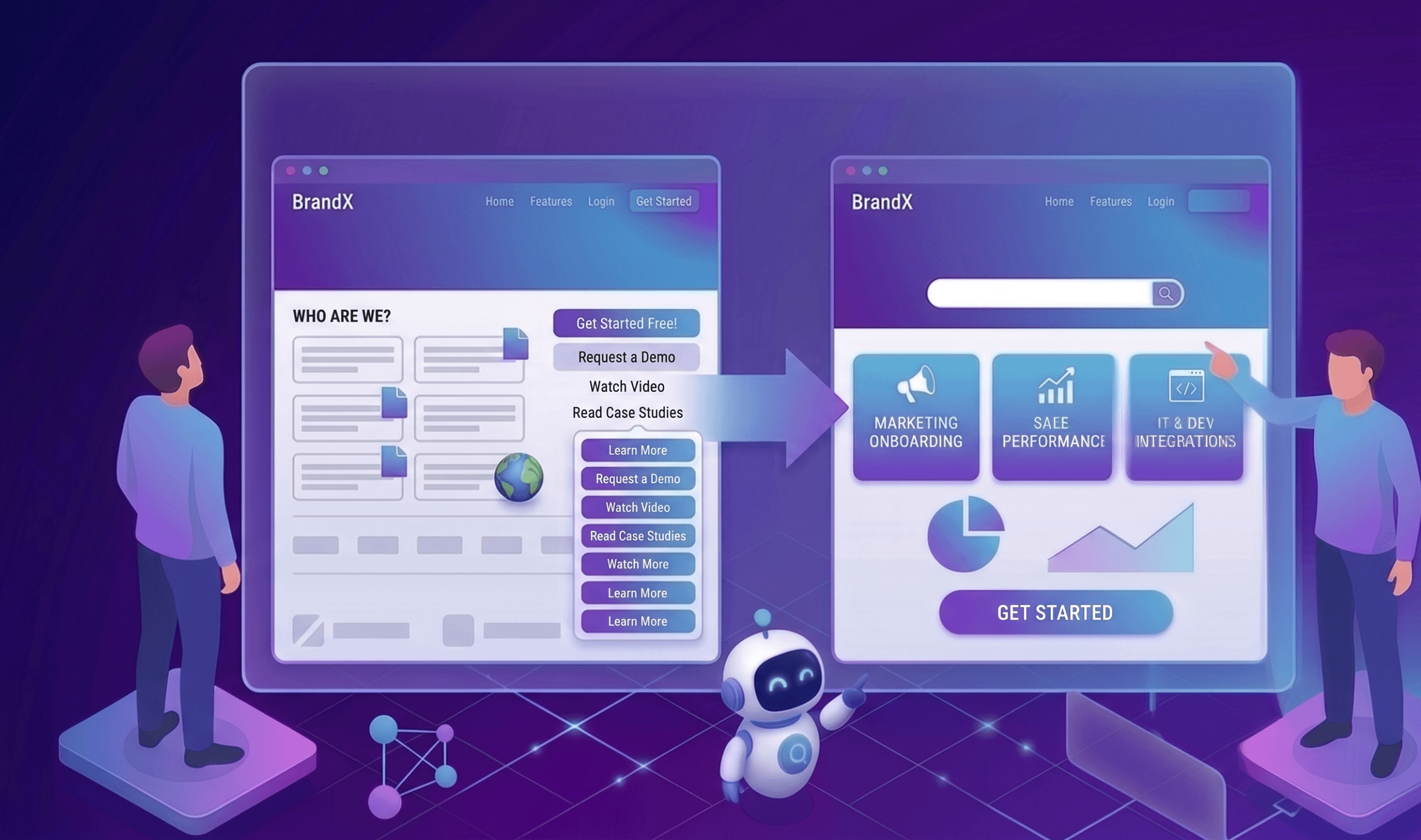
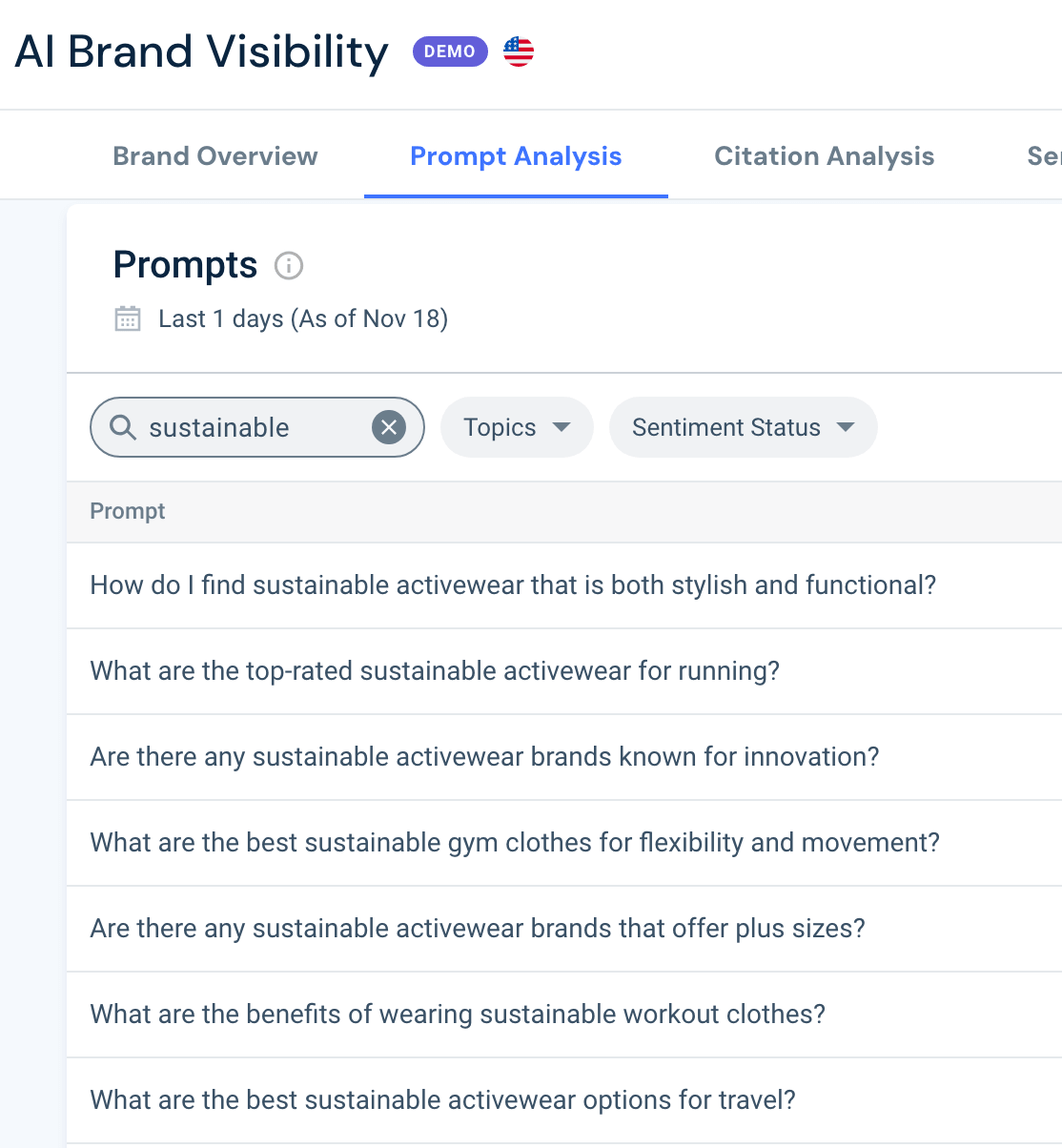
Optimize your homepage for AI traffic by treating it as the front door for a visitor who already knows what you do, not one who’s hearing about you for the first time. AI systems cite your deep pages, but the click almost always lands on the homepage instead, so most sites are handing their best new traffic to the one page still built for a stranger.
That mismatch in how people find and visit websites has gotten worse over the past year, and it did not happen gradually. Average monthly web visits across generative AI platforms worldwide reached 9.5 billion between June 2025 and May 2026, up 70% year over year, according to Similarweb’s 2026 Generative AI Landscape report.
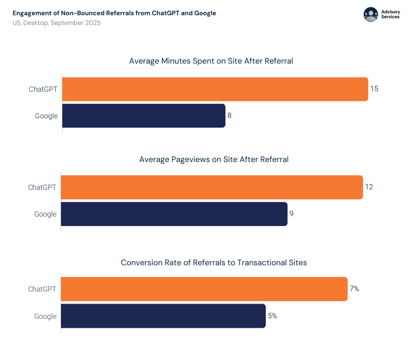
That traffic is not a lesser substitute for search either: visitors referred from ChatGPT spend roughly 15 minutes on site and view 12 pages on average, compared to 8 minutes and 9 pages for visitors referred from Google, and convert at 7% versus 5%, per the same Similarweb research (US, desktop, September 2025). Whatever this channel is, it sends fewer people than search, and better ones.
The mechanism sending them changed too, abruptly. On May 7, 2026, ChatGPT started turning brand names inside its answers into clickable links instead of footnote-style citations, and referral traffic responded immediately: total ChatGPT referrals rose 157.7% week over week, with homepage referrals specifically surging 354.7%, more than twice as fast.
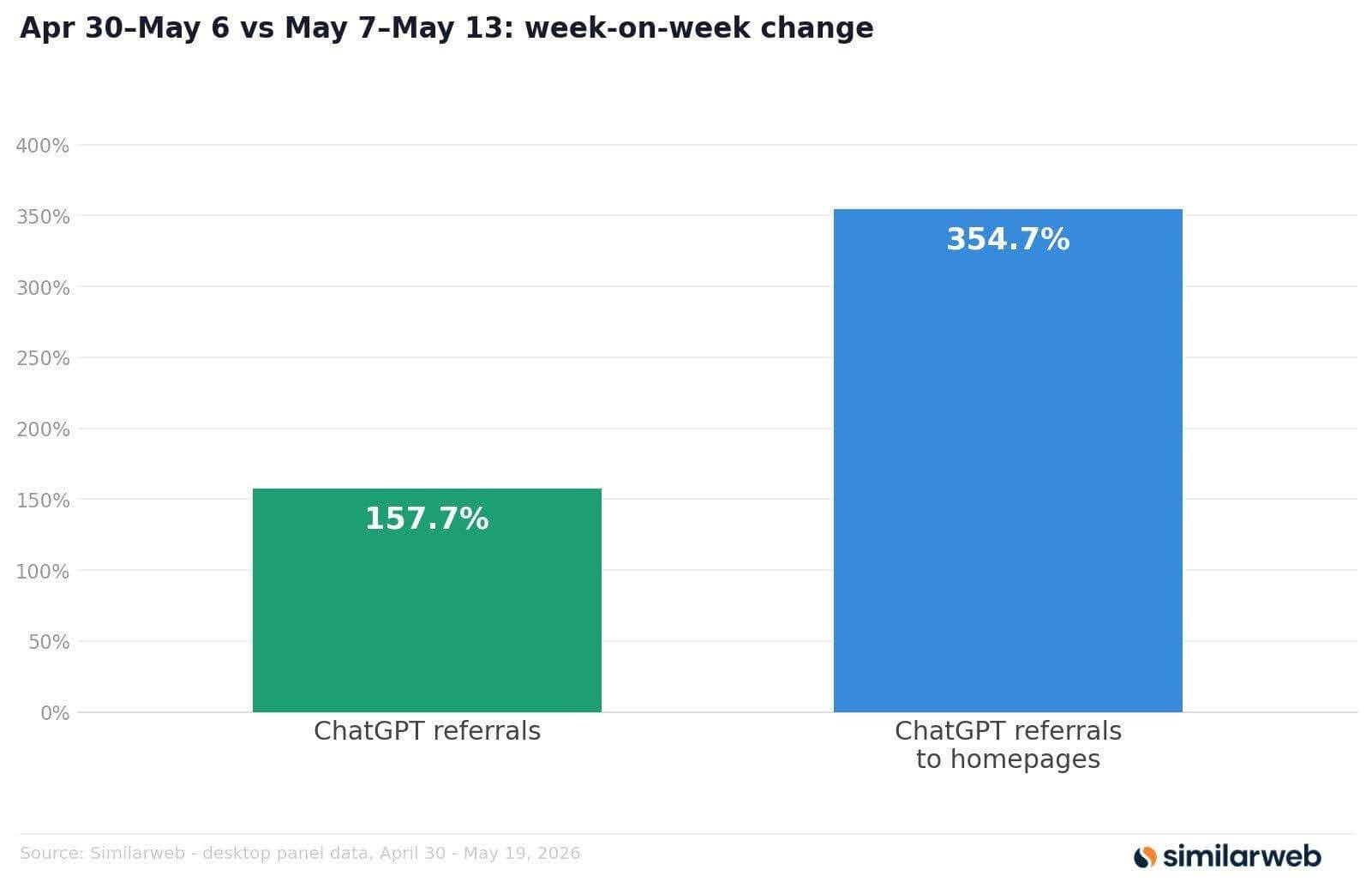
It took a pattern that was already lopsided and made it more so.
Here’s the pattern itself: this traffic lands on the homepage, almost no matter what page the AI actually pulled its answer from. That’s not a small routing detail. It means the page getting your best new traffic right now is probably the one page nobody thought to redesign for it.
I use ClickUp as a live, checkable example throughout this piece: its actual homepage and traffic data, rather than asking you to take the pattern on faith. But the pattern itself is not specific to that one company. It is the shape of AI referral traffic almost everywhere.
AI systems and humans split into two separate events on most sites: the citation and the click. An AI system answering a question is usually pulling its answer from a deep page, a comparison, a doc, an FAQ block, structured the way generative engine optimization asks it to be. But the link it actually hands the human, and the visit Similarweb’s own AI referral data captures, disproportionately lands on the homepage instead.
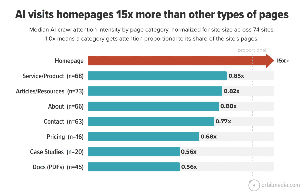
I have seen this pattern reported independently more than once. Orbit Media analyzed AI crawl and referral data across 74 Cloudflare accounts and found that homepages get roughly 15 times more AI attention than other page types, and named a specific, related phenomenon they call the “Dark Library Effect”: articles get read and summarized by AI systems but rarely get the click, while the homepage does.
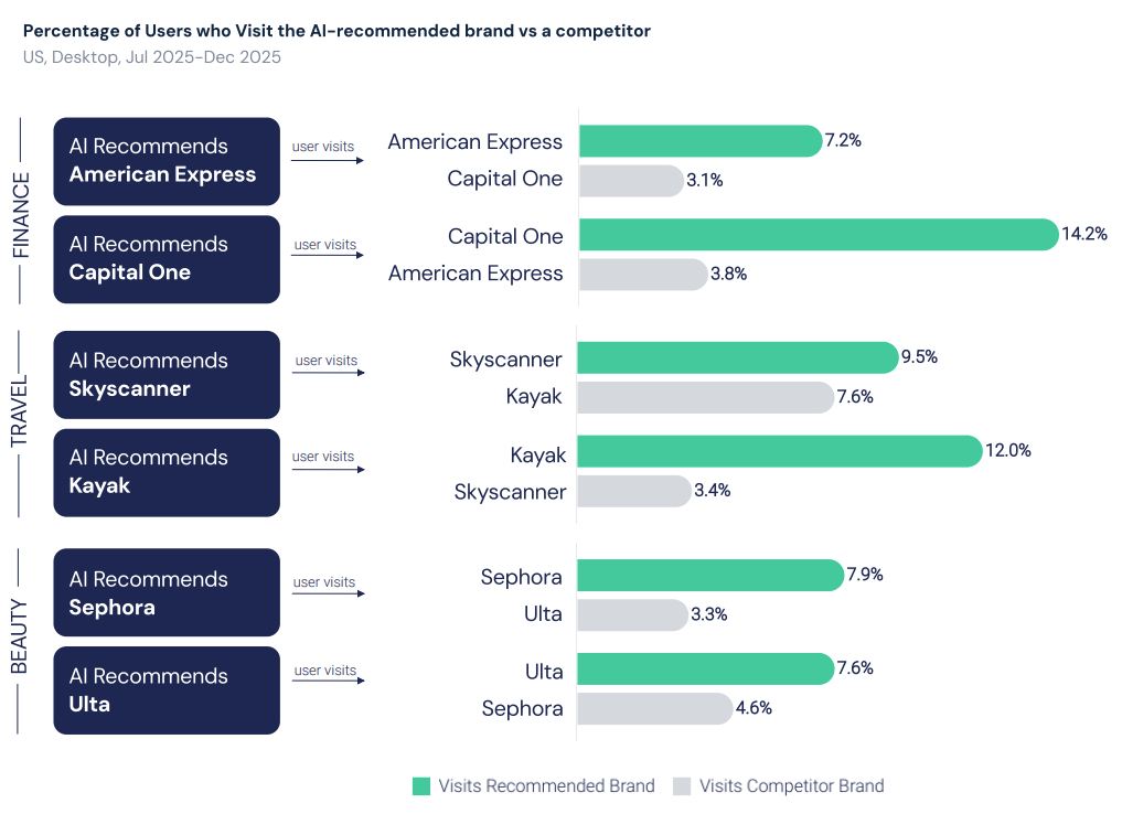
On top of that, a second pathway compounds the effect, and Similarweb’s Downstream Impact Of AI Visibility research on this is clear: users who receive a brand recommendation from ChatGPT are 2.5 times more likely to visit that brand’s site within the next seven days than to visit an unrecommended competitor, even with no link and no prior visit.
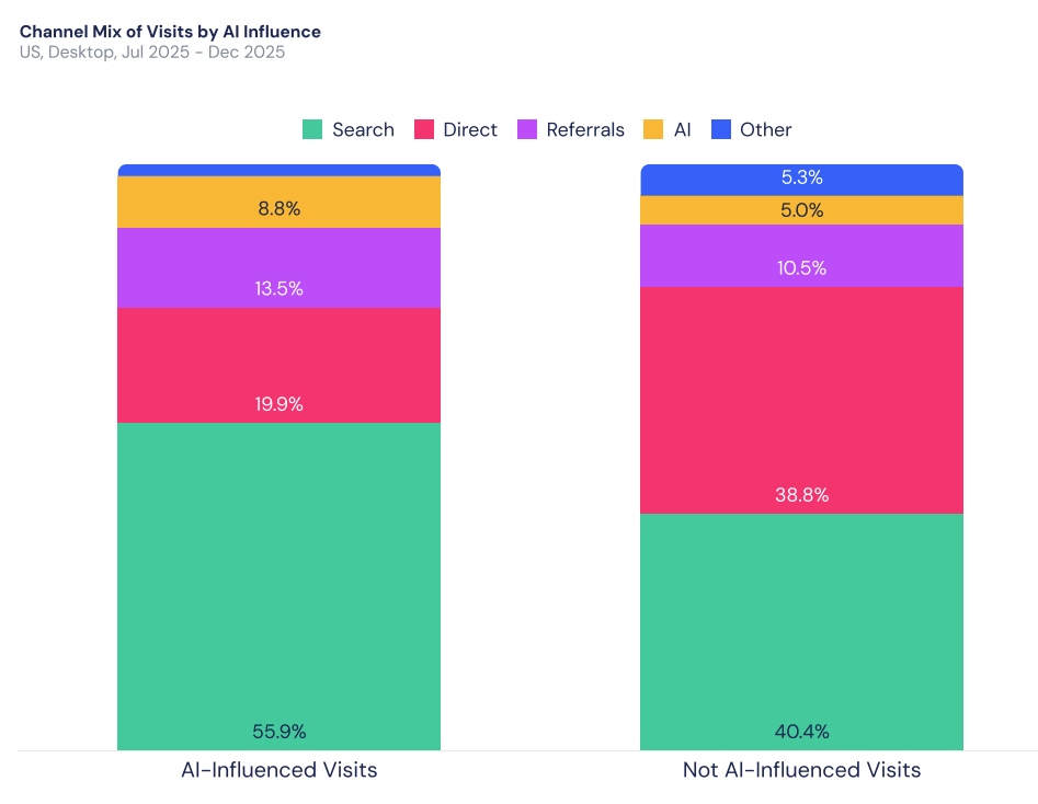
When they do visit, over half of those AI-influenced visits (55.9%) arrive through search, compared to 40.4% for visits with no AI influence (US, desktop panel, July to December 2025).
The user remembers the brand and goes looking for it, and branded search results are dominated by the homepage.
In neither case does the visitor land on the page that actually contained the information they were told.
This is a genuine change in how people arrive at a site, not just a new source of clicks. The old version of this: someone hears a brand name once, searches it on Google, and clicks through cold, with nothing but the name itself to go on.
That is not who is showing up now.
Today, whether through AI or search, that visitor arrives already informed. They do not need the front door to explain who you are, since the AI engine already did that part of the job.
This is exactly where the standard “who are we, what do we do” homepage template stops earning its place: it is built for a visitor the AI-referred visitor no longer is. A homepage built for a cold, first-time visitor and a homepage built for an already-briefed one are two different jobs, and most sites are still only doing one of them.
This is the homepage half of a framework I built for exactly this problem, the AI Referral Architecture Audit, which scores every page on a site against the job it’s actually doing instead of assuming one design serves every visitor.
For a homepage specifically, that means checking for the signals that separate a page built for a cold visitor from one built for a visitor who already knows the brand: how fast it gets someone to a decision, whether the copy still stops to explain the basics, and whether someone who already knows what they want can actually find it.
I score these seven criteria:
These seven trace back to the studies aggregated in the article that inspired this piece: Similarweb’s data, Previsible’s research on internal-search referrals, and Pew Research Center’s findings on how often people click through after an AI summary, and Ahrefs’ analysis, all converging on the same pattern: AI systems increasingly cite a site’s deep pages while sending the human visitor to the homepage instead, and most homepages have never been rebuilt for that already-informed visitor.
That pattern points to one conclusion: an already-informed visitor needs a fast, direct path to a decision, not a funnel built for someone hearing about you for the first time. These seven checks come straight out of that conclusion.
Every criterion checks a different way a homepage can fail that visitor, and they group into five jobs:
Each criterion is scored 0 to 2 rather than a simple yes or no (most of what separates those two homepages is not binary). A trust signal can be present but buried, or a headline can partially explain the category instead of fully explaining it or skipping the explanation altogether.
That middle value is the actual reason for a 0-2 scale instead of a checkbox: a page that’s halfway to right should not score the same as a page that isn’t there at all, and a strict yes-or-no would flatten that difference to nothing.
Fourteen points possible. Ten or above means the page is ready for a visitor who already knows what you do.
I ran two homepages through this rubric side by side: ClickUp, and monday.com, a direct competitor. For every criterion below, I checked the page’s real source code, ran an actual page-load measurement through the browser’s Navigation Timing API in Chrome, and pulled a live G2 review for each product rather than guessing at what customers say. Nothing here is estimated.
Here is how to check each one yourself, and what I found on both homepages when I did.
Count the distinct call-to-action buttons visible on the homepage without scrolling, and check whether they all say the same thing or compete with each other.
How to score this criterion:
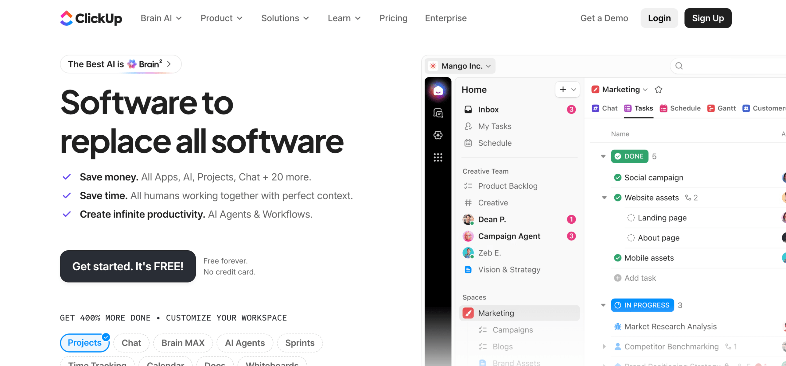
ClickUp runs at least 10 different competing calls to action across 12 on one page:
That’s multiple different actions competing with no clear primary, which scores 0/2.
Monday.com repeats one action, “Get Started,” 77 times and introduces no second one. That’s one action repeated with no competing alternative, which scores 2/2.
Read the headline by itself, with nothing else on the page, and ask whether it explains what the product category is or assumes you already know.
How to score this criterion:
ClickUp’s headline, “Software to replace all software,” is a vague tagline: it doesn’t stop to over-explain, but it doesn’t clearly speak to an already-informed buyer either. That’s neither over-explaining nor clearly assuming context, which scores 1/2.
monday.com’s headline, “People and agents working as one team,” never explains the category, and only makes sense to someone who already knows that monday.com’s product now centers on agentic workflows, the kind of detail a visitor would only have if an AI system already told them so.
That’s a headline that fully assumes context, which scores 2/2.
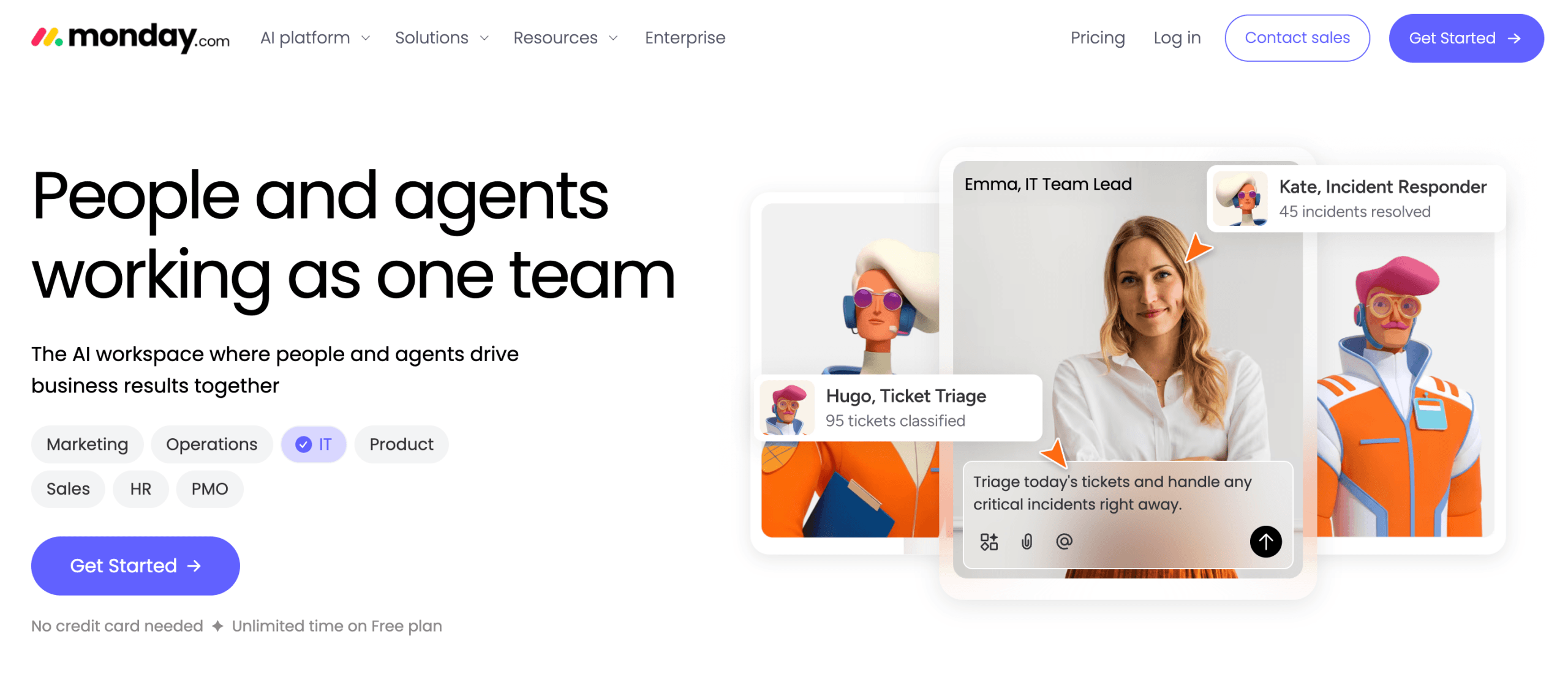
Look for a link or section addressed to a specific type of visitor, by department, role, or use case, sitting directly on the homepage itself, not just inside the navigation menu.
How to score this criterion:
ClickUp has no persona or department links. What it has instead is a row of feature tags (Projects, Chat, AI Agents, Time Tracking, and others) that toggle which product screenshot displays, a feature directory every visitor sees the same version of, not a route based on who they are.
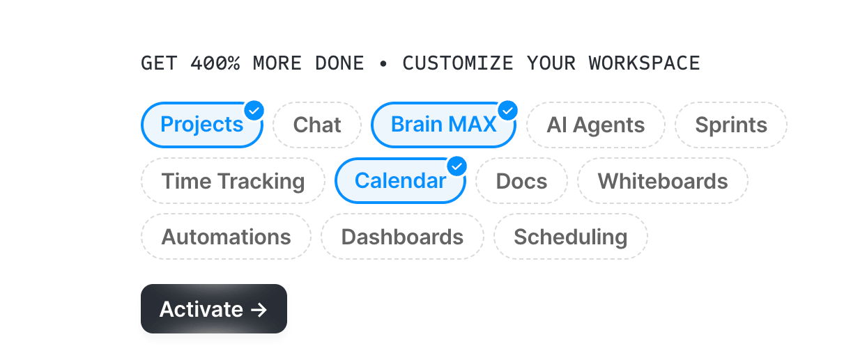
That’s no acknowledgment of different visitor intents at all, which scores 0/2.
Monday.com puts real department sections (Marketing, Sales, IT, HR, and more) directly on the page where a scrolling visitor sees them, not buried in a nav dropdown. That’s a real, distinct destination for a specific visitor type, which scores 2/2.
Check whether a specific, named proof point, a customer count, a named client, or a review score appears without scrolling, not just a generic “trusted by thousands” claim.
How to score this criterion:
ClickUp’s real proof points, “85% of Fortune 500 companies,” “92,400 hours saved,” and “3M+ tasks automated by Agents,” are specific and quantified, but they sit well down the page, past a long stretch of AI Agent marketing. Near the top, all a visitor sees is the generic, unquantified “Trusted by the best”. 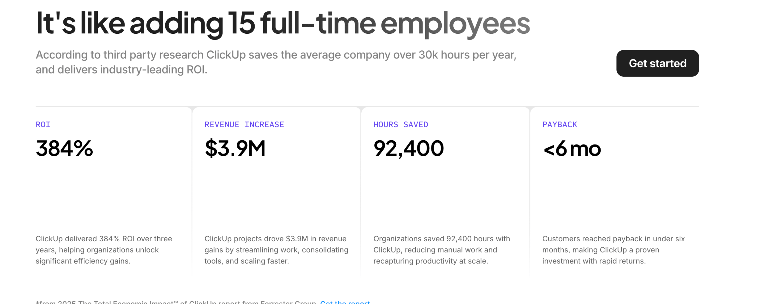
That’s a real trust signal that sits further down the page, which scores 1/2.
Monday.com leads with “trusted by over 60% of the Fortune 500” immediately below its headline. That’s a specific, quantified proof point a visitor sees right away, which scores 2/2.
For your own homepage, pull ten to fifteen recent reviews per product (enough to identify recurring themes without turning this into a full sentiment-analysis project). Then compare what they say against what the homepage claims.
How to score this criterion:
For ClickUp, the G2 aggregated score across all reviews (4.6/5 overall) credits the platform for flexibility and customization, but names “overwhelming due to the extensive features available” as the trade-off, the same complaint the homepage’s own CTA clutter echoes rather than contradicts. That’s a mismatch that stops short of a direct contradiction, which scores 1/2.
For monday.com, the G2 aggregate across all reviews (4.7/5 overall) credits the platform for “ease of use and powerful automation,” not for AI agents. The homepage headline, “People and agents working as one team,” leads with a (possibly new) theme its own reviewers don’t spontaneously praise. That’s a mismatch in emphasis, not a contradiction, which also scores 1/2.
Look for a visible search input on the page itself, then check the page’s source code for SearchAction schema, since that is what makes search machine-readable to an agent as well as a human.
How to score this criterion:
The one search-labeled input I found on ClickUp’s page turned out to be a cookie-consent list filter, not site search, and monday.com has zero search elements of any kind either. Neither has any real search functionality, which scores 0/2 for both.
Measure Time to First Byte and DOMContentLoaded through the browser’s Navigation Timing API, or read them directly off Chrome DevTools’ Network tab: open DevTools (F12), reload the page, and both appear as labeled markers in the waterfall.
How to score this criterion:
ClickUp’s TTFB averaged ~59ms, solidly good, with DOMContentLoaded averaging ~953ms. Both measures fall in the good range, which scores 2/2.
Monday.com’s TTFB averaged ~387ms, in the “needs improvement” range, with DOMContentLoaded averaging ~773ms, which is good on its own. Only one of the two measures is good, so the score is 1/2.
Here is the full scorecard those seven checks produced:
| Criterion | ClickUp | Monday |
| CTA consistency | 0/2 | 2/2 |
| Context fit | 1/2 | 2/2 |
| Intent routing | 0/2 | 2/2 |
| Visible trust signals | 1/2 | 2/2 |
| Reputation fit | 1/2 | 1/2 |
| Search and navigation prominence | 0/2 | 0/2 |
| Mobile load speed | 2/2 | 1/2 |
| Totals | 5/14 | 10/14 |
Conclusion: ClickUp is weak on the criteria that decide whether a visitor gets to a decision quickly. No clear single call to action, no segmented paths, no search, buried trust signals, and its one real strength, server speed, doesn’t compensate for that.
Monday.com, the stronger comparison here, clears every one of ClickUp’s weak criteria and still isn’t perfect: its own gaps are the same missing search, plus a server response noticeably slower than ClickUp’s.
Five of these fixes are short enough to sit in a table; two need more room and get their own section below it.
| Criterion | The fix |
| CTA consistency | Pick one primary action and repeat it consistently, the way monday.com already does. |
| Context fit | Cut the category explainer entirely and lead with differentiation instead of definition, the way monday.com’s headline already does. |
| Intent routing | Put real department or persona sections directly on the page, not buried in a nav dropdown, the way monday.com already does. |
| Visible trust signals | Move a quantified proof point, like the hours-saved or Fortune 500 stat, up near the headline instead of leaving only a generic “trusted by” badge there, the way monday.com already does. |
| Reputation fit | Read what your own reviews say before finalizing homepage copy, and address a known friction point instead of letting the homepage make it worse. |
ClickUp’s homepage alone captures roughly 31.7% of its combined ChatGPT and Perplexity referral traffic share, according to Similarweb data, the largest share of any single URL on the site, and it has no visible way for a visitor to search once they land.
That combination, high AI traffic volume paired with no search function, means a visitor who already knows what they want has no fast path to it, and no fast path means going back to the AI tool that sent them.
The fix: add a prominent, intent-matching search bar to the homepage itself, not buried in a menu. Pair it with autocomplete and synonym matching so a visitor typing “AI Agents” or “Zoom integration” gets routed immediately, since an already-briefed visitor is searching for the specific thing an AI already told them about, not browsing for an introduction.
The technical part can be executed without a redesign. Schema.org’s SearchAction markup makes a site’s search function machine-readable, the same mechanism Google uses to power sitelinks search boxes, and it takes this shape on a homepage:
{
"@type": "WebSite",
"url": "https://example.com/",
"potentialAction": {
"@type": "SearchAction",
"target": "https://example.com/search?q={search_term_string}",
"query-input": "required name=search_term_string"
}
}
That single block, paired with a visible search input on the page itself, is what turns “no search element found” into a page an agent or a crawler can identify as searchable, not just a page a human happens to notice a search icon on.
This is monday.com’s gap, not ClickUp’s, a slow server response measured as Time to First Byte, the delay before any content can start arriving at all, checked the way described in the audit above.
The fix here sits upstream of the homepage itself: faster edge caching or CDN configuration reduces TTFB directly, and it is worth checking before assuming a design change is needed.
I built this scoring rubric as one tab in a working Google Sheet template alongside a matching rubric for deep pages and an internal-search checklist, so you can run the same audit on your own homepage. Get the AI Referral Architecture Audit template.
This is not a slow-moving trend, as the May 7 update in the intro already shows. The part worth adding here is what happened to homepage share specifically: before the change, roughly 26 to 32% of ChatGPT referrals landed on the homepage. After, that jumped to about 60% and has held steady since, according to Similarweb’s previously mentioned analysis. Users arrived at the front door, not a specific room, and that front door increasingly is where the AI-referred audience actually shows up now, not a hypothetical future audience.
For ClickUp specifically, US AI referral visits averaged roughly 39k per month from December 2025 through June 2026, against average US organic search clicks of roughly 454k per month from April through June 2026, according to Similarweb data. That is roughly 8.6% of organic volume in the US market.
This is not unique to ClickUp either: monday.com shows the same pattern at a smaller but still real ~6% of its own organic volume. Small in absolute terms for both, and structurally growing faster on the one page, the homepage, that most sites have not redesigned for it.
The structural fixes here also feed directly into answer engine optimization performance, since a page an AI system trusts enough to send a visitor to is, functionally, a page it already trusts enough to answer with.
For more than twenty years, a homepage had one job: introduce a cold visitor to a brand they had never heard of. AI did not break that job. It added a second type of visitor, one who already finished the introduction somewhere else, and most homepages, ClickUp’s and monday.com’s included, are still only built for the first one.
The seven-criterion score above is a one-time structural check, and the moment you fix what it flags, the score itself stops being an interesting number. What matters after that is watching the actual traffic: whether your homepage’s share of AI referrals keeps climbing the way the overall pattern has since the May 7 change, whether bounce rate on that traffic drops, whether more of it converts.
Similarweb’s AI Search Intelligence is built for exactly that, tracking which pages AI systems are citing and which they are actually sending visitors to, and whether that changes once you act on a score like the one above.
Audit the structure once. Track the traffic on an ongoing basis. A homepage only earns its keep with an already-informed visitor if it does both.
AI referral traffic is a visit that arrives at your site from a link to an AI engine (ChatGPT, Perplexity, Gemini, or similar), surfaced inside its own answer. It is a distinct channel from organic search traffic and, in my experience, frequently misattributed to “Direct” in standard analytics setups.
Because citation and referral are two different events. The AI builds its answer from whichever page best supports the claim, often a deep page, but the link it actually surfaces to the human frequently points to the homepage instead, and people who consult an AI tool about a brand often search for that brand by name afterward regardless. Both paths send an already-informed visitor to the front door, not to the page that did the informing.
No, and this is worth being direct about since a full redesign is the expensive, slow answer to what is usually a fast, cheap fix. Audit against the seven criteria first, then fix only the ones that actually fail. A homepage that already handles most of them well typically has one or two specific gaps left, not a structural problem. A homepage that fails most of them needs more work, but still criterion by criterion, not a wholesale rebuild. The score tells you which case you’re in before you commit to either.
Run it through the same seven-criterion scorer above. The most common failure pattern is several competing calls to action, no segmented paths for different visitor types, and no real search. That combination is worse than any single gap on its own, since it compounds. If your homepage already avoids that pattern, the two gaps worth checking anyway are search and server response time, since those are the two criteria most sites have never had a reason to think about until now.
Because most of it is arriving mislabeled. AI apps frequently strip referrer headers, so visits that actually came from ChatGPT, Claude, or Perplexity often land in your “Direct” bucket instead of a labeled channel. Google added a native AI Assistant channel to GA4’s Default Channel Group on May 13, 2026, which helps for web-referred traffic, but visits from AI mobile apps that strip referrer data entirely still go uncounted. If your homepage’s Direct traffic has grown without a matching increase in brand campaign spend, some of that growth is very likely AI referral traffic hiding in plain sight.
Director of SEO & AI Search at Similarweb
Limor brings 20 years of expertise in SEO and AI Search. She thrives on solving complex problems, creating scalable strategies, and building amazing dashboards.
ChatGPT Ads CTR by Country: Brazil, Mexico and Japan Out-Click the US by More Than 2x
What is RAG (Retrieval-Augmented Generation)? A Marketer's Guide
Gen AI Glossary: The Must-Know AI Search Terms
Give it a try or talk to our insights team — don’t worry, it’s free!